AIRBORNE AIRLINES
UX & UI Design Project
User Experience Design | User Interface Design | Moodboard and Branding | Usability Testing | High Fidelity Prototype | Mobile Screen Interface | Responsive Design | Project Time: 3 weeks
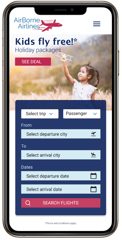
AirBorne Airlines is new to the market and looking to build a high fidelity responsive prototype that allows users to book an economical and comfortable flight experience and also to expand its online presence by introducing a mobile-friendly app. With the help of user research, usability testing, Ideation, high fidelity prototype and experimenting interface guidelines, I created MVP (minimum viable product) for ABA.
Design Brief
UX team have researched the market need for an airline and went through a series of desk research, user interviews, ideation, concept design and user testing. Now that the concept has been validated by research, the website is ready for its next iteration.
Based on the user knowledge from the first round of UX research, It is now required to deliver a compelling UI, especially for a mobile-friendly website.
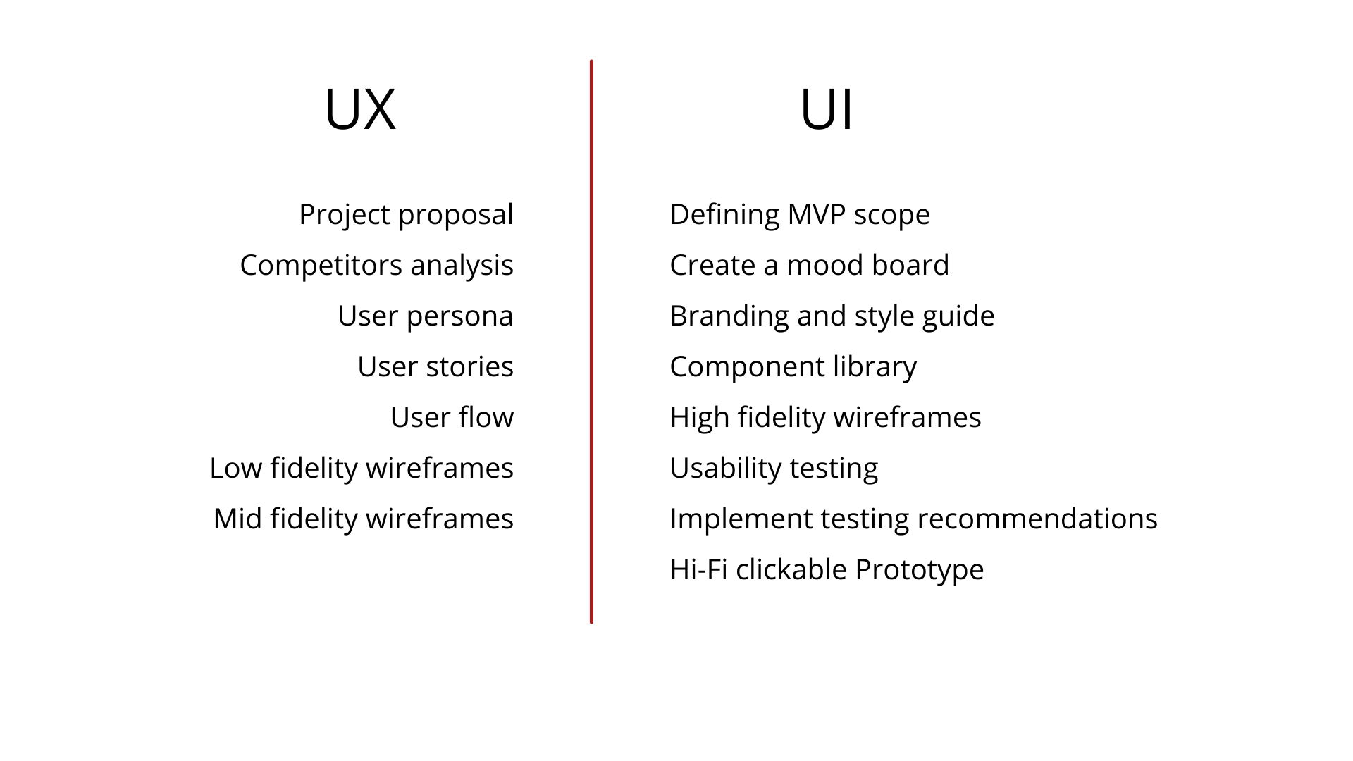
My Role
Tools and Technology
Following is the list of tools and technologies used for the completion of the project.
Figma is a vector graphics editor and prototyping tool which is primarily web-based, with additional offline features enabled by desktop applications for macOS and Windows. On its own, Figma is a comparable product to Adobe XD or Sketch, with the added benefit of it, is exceptionally easy to share documents in a group. In UI/UX agencies, Figma is used as a modern interface design tool, given the ability for easy collaborations and cross-communications.
I have used Figma for creating the mood boards, UI flow, Low-fi and all the way to hi-fi clickable prototype.
Zoom’s secure, reliable video platform powers all of my communication needs, including meetings, chat, phone, webinars, and online events.
I used zoom for conducting usability testing and interviewing the users. It was a very helpful tool where I could see, listen and hear the users while interacting with the website.
Google Forms is a survey administration software included as part of the free, web-based Google Docs Editors suite offered by Google.
During the usability testing, I wanted to give freedom to my testers because of their busy schedules and unavailability at zoom meetings. Therefore, I used Google forms to collect detailed feedback and recommendations from respondents.
Adobe Stock is a service that provides designers and businesses with access to millions of high-quality curated and royalty-free photos, videos, illustrations, vector graphics, 3D assets, and templates for all their creative projects.
As an airline website, AirBorne Airlines need to have images of various destinations. Therefore, I used my subscription to download royalty-free images from the Adobe stock collection.
Canva is an Australian graphic design platform, used to create social media graphics, presentations, posters, documents and other visual content.
I used Canva for managing all the graphic works before putting them on the website interface.
Adobe Illustrator is a professional vector-based design and drawing program. Used as part of a larger design workflow, Illustrator allows for the creation of everything from single design elements to entire compositions. Designers use Illustrator to create posters, symbols, logos, patterns, icons, etc.
I used illustrator to design the logo for the company as well as a few other illustrations for the website.
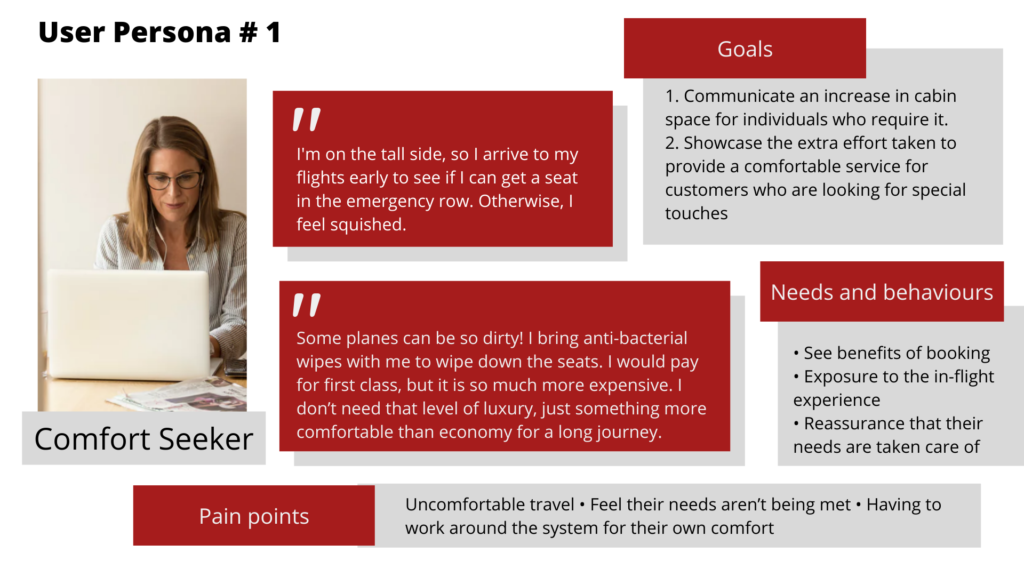
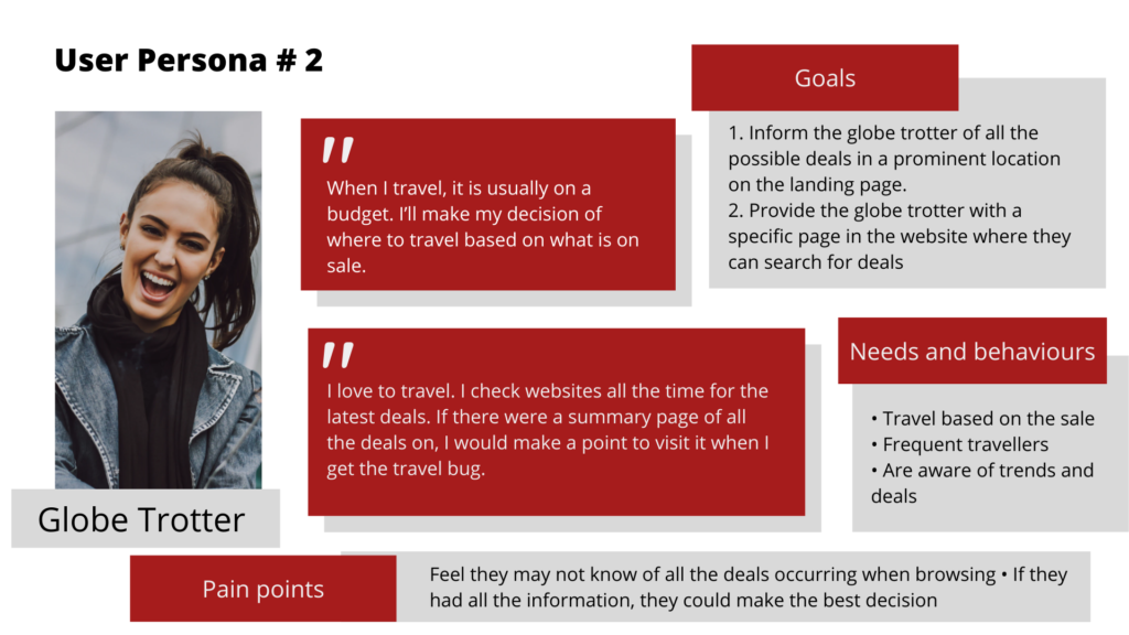
User Persona
A user persona is a fictional representation of the ideal customers. As a UX designer, I started the design process by studying user research – building empathy with the target users and identifying what they need from the website. UX research helped me to create two user personas.
Low Fidelity Wireframes
Wireframes provide a clear overview of the page structure, layout, information architecture, user flow, functionality, and intended behaviours. As a wireframe usually represents the initial product concept; styling, colour, and graphics are minimal.
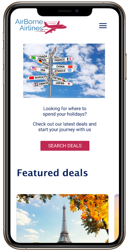
As ABA is new to the market, initially, they will release an MVP (minimum viable product) to the public. The requirement for an MVP at this stage is having a Home (landing page), Deals, Experience, Help and Search.
Objectives for UI Design
In order to stay on track as per the requirements of MVP and focus on the needs of users, I established two goals.
- Provide users a comprehensive description of the in-flight experience
- The research found that passengers did not always know what to expect during their flight and had to take extra precautions to ensure their experience was pleasant. ABA will provide a full explanation of the in flight experience, including photos, videos, and a description of the meal options.
- Display all the deals on a summary page for deal lovers and globe trotter
- Most of the travellers usually make decision of where to travel based on what is on sale. They check websites all the time for the latest deals. If there were a summary page of all the deals on, they would make a point to visit it when they get the travel bug.
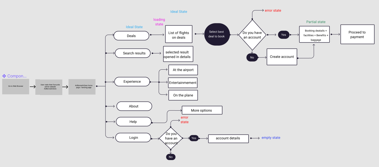
User Interface Flow
The user flow lays out the user’s movement through the product, mapping out every step the user takes—from the entry point right through to the final interaction. Designs are constantly being revised, and user flows may be revisited and edited if further research is necessary.
I studied and decided what the UI flow would look like based on the user’s motivations and pain points. I kept the user at the centre of the process, which gave me clarity of vision and direction. It is a good idea to include details about the UI states with the UI flow, which will provide a holistic view of what will be occurring throughout the experience. It will also help the developer know what to plan for and instigate conversations about implementing the states.
Here is the one flow diagram that maps the design blueprint addressing all gaps and accounting for all states (ideal, partial, error, loading, empty).
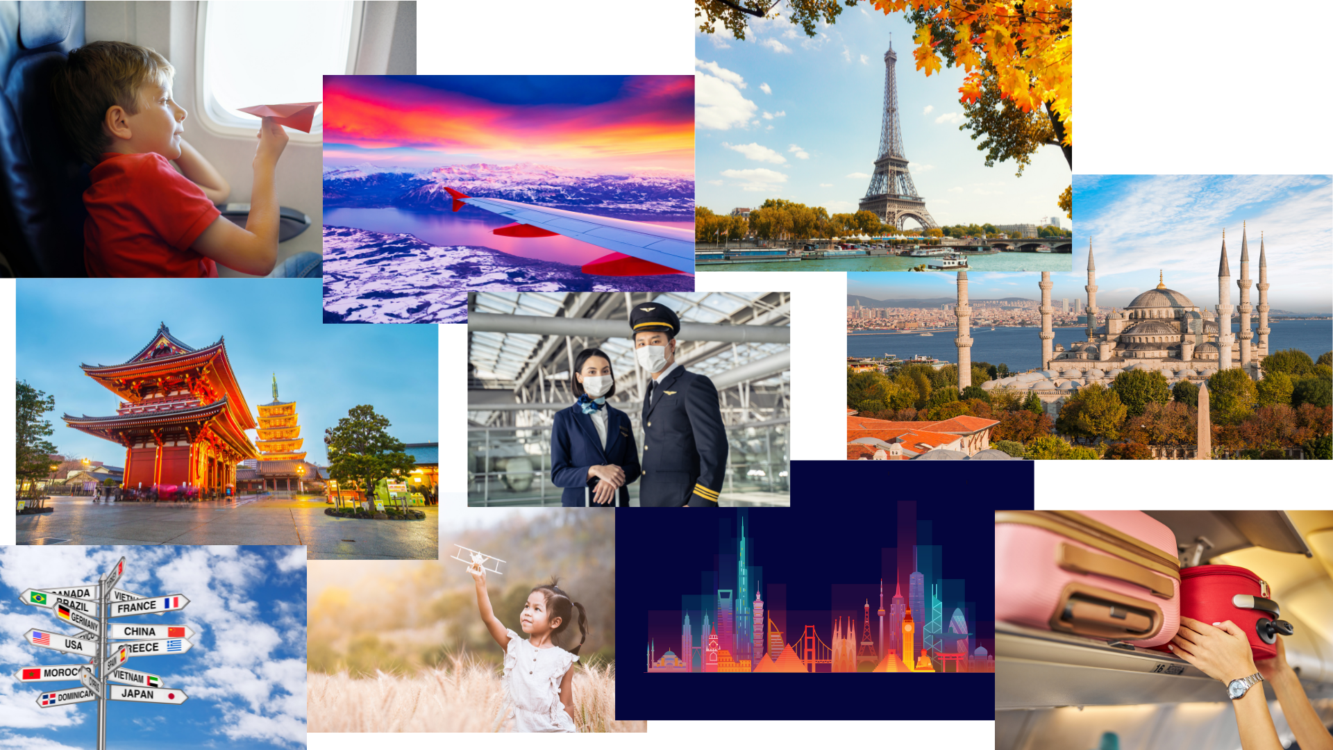
Mood board
Designers, writers and artists have always been collectors. Collecting is a means of developing an aptitude, of training one’s eye and beginning to test our aesthetic against those we admire. In this way, a mood board, which is only a modernised version of a cabinet of curiosities, is an enumeration of images, colours, shapes, places, things or ideas that display some common referent or context. In UI design a mood board usually consists of images, fonts, interactions, features, icons and the collected elements necessary to communicate the artistic direction of a project.
I enjoyed creating a mood board for an airline company since it was inspiring. After I thought about all the reasons why someone would want to travel to a particular location and why they would be drawn there, I found creating mood boards to be easier and more enjoyable. Most of the images were taken from my licenced account of Adobe Stock.
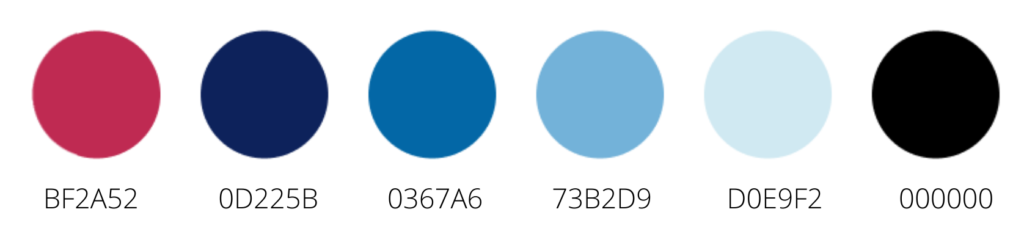
Design Guidelines
In my mind, great user experiences are usually the result of three things: usability, utility, and desirability. I made design guidelines to help myself build the website in a consistent way, to high quality and quickly. These guidelines include visual languages, style, best practices and tooling.
From business people to backpackers, I wanted to ensure my design was user-friendly for all types of users. My goal was to set a mood of culture and cleanliness while also not seeming overly expensive. In terms of colour, I selected the shades of the sky from royal blue to light blue shades and added pink as an accent colour.
In terms of typography, I used Sans serif fonts like Roboto as our main font type and LucidaSans for headings only. The purpose of using sans serif is to represent sophistication and modern style with easy reading.
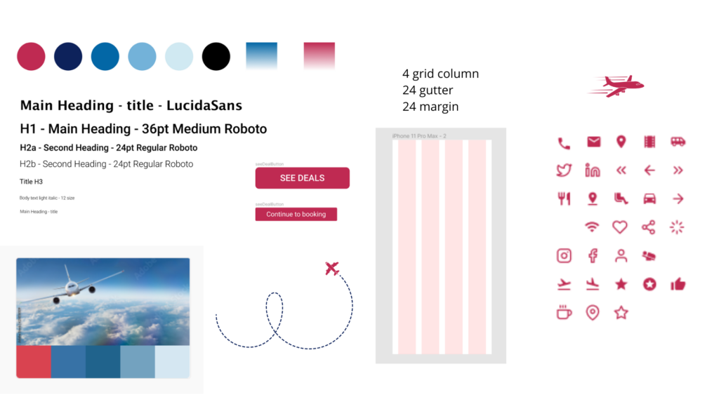
- Colour schemes
- Font style
- Font size
- Icons and symbols
- Button
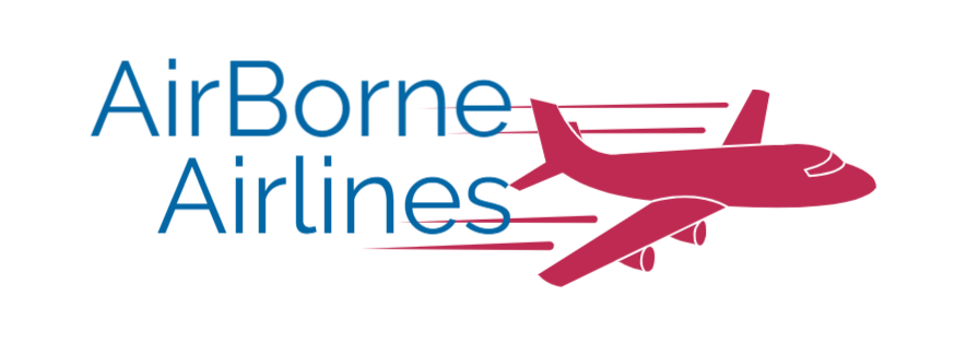
Logo Designing and Branding
Keeping the colour schemes, font style and company mission in mind, I designed the airlines’ logo.
Component Library
I made a library containing a cohesive set of components capable of building a page design as specified in the design brief. It was at this stage that I was constantly updating and changing.
UI Stack
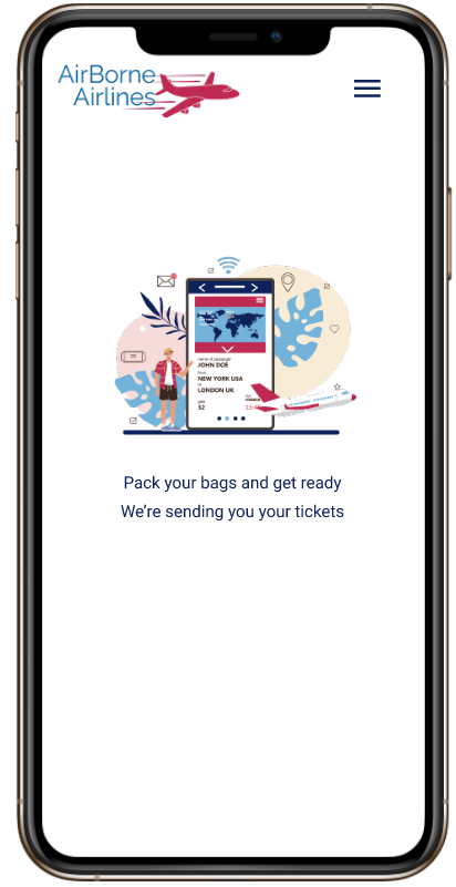
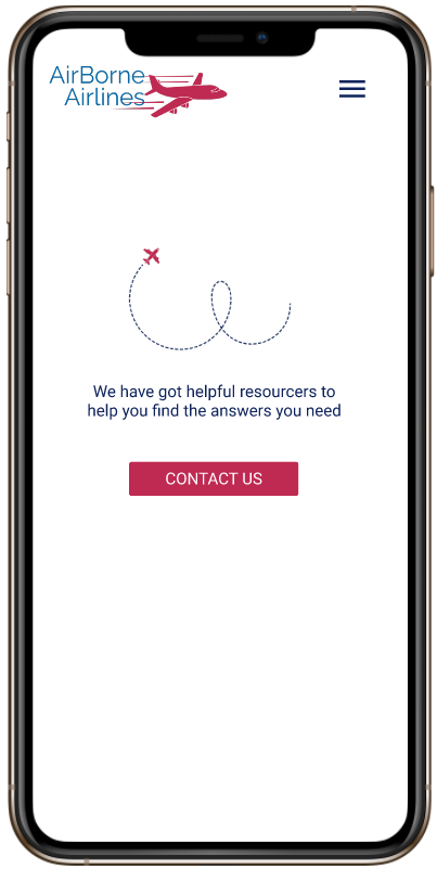
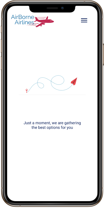
To create a seamless user experience, we must consider the five states of the UI stack: ideal, partial, empty, loading and error. Often when a website or app feels incomplete or jarring it’s because it lacks one of these states. I made five states of the UI stack based on the UI flow.
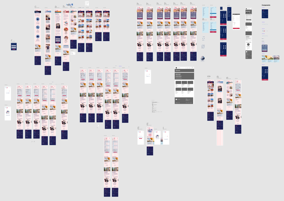
Demonstration of iterative process in building screens/pages
Design is an iterative process, and to maintain my design system, I also have to iterate. My designs aren’t done once distributed live to the public. Patterns are always changing and so are my users. I think of my design system as living documentation. It’s always evolving.
At this step, I learned to iterate my designs by zooming in and examining the different components as they interact in the form of atoms, molecules, organisms, templates and pages.
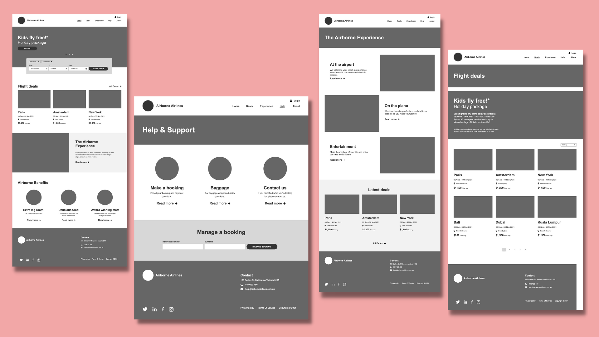
Mid-Fidelity Version
The mid-fidelity pages should have a defined layout, components, icons and colours, but do not need to include interactive elements or links between screens. I included the five states – ideal, empty, partial, loading and error – to give mid-fi a real feel and touch.
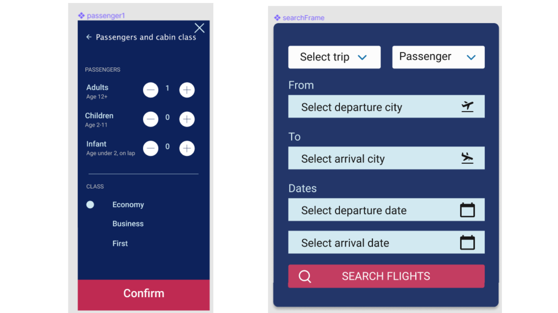
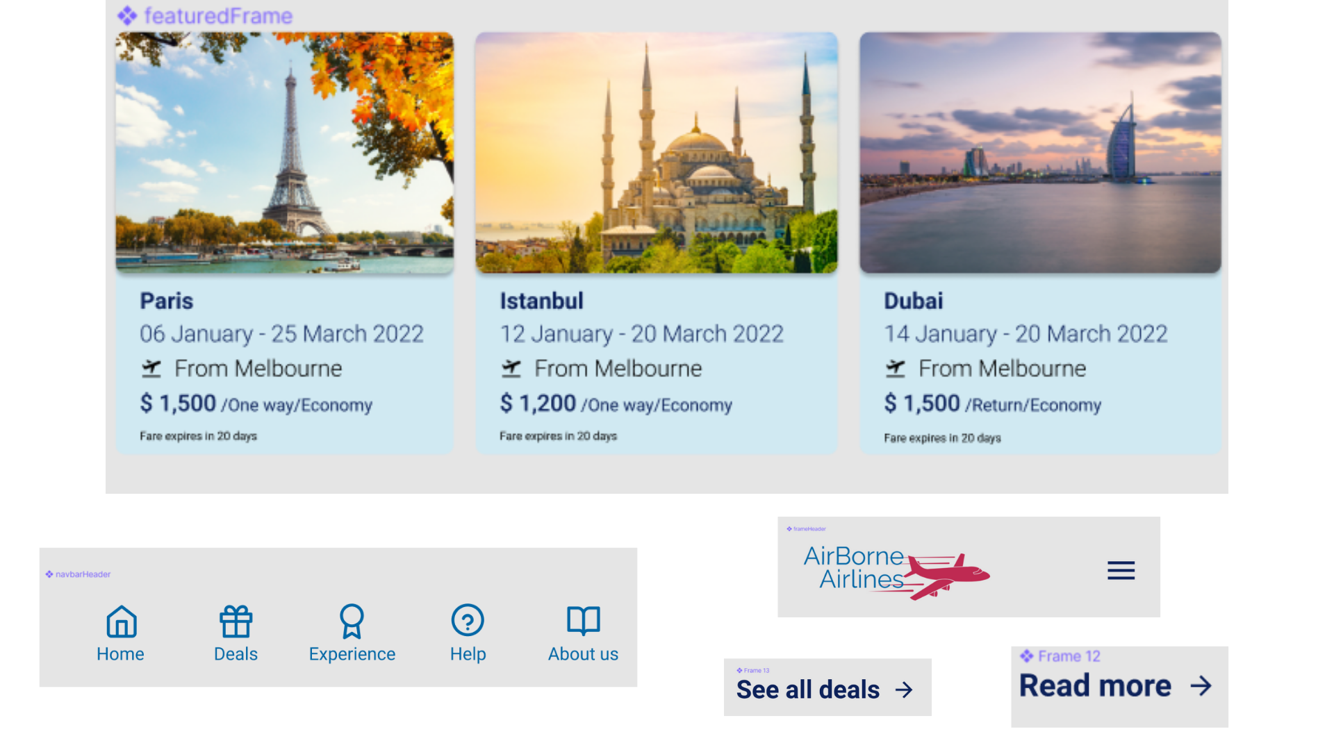
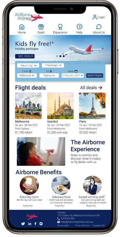
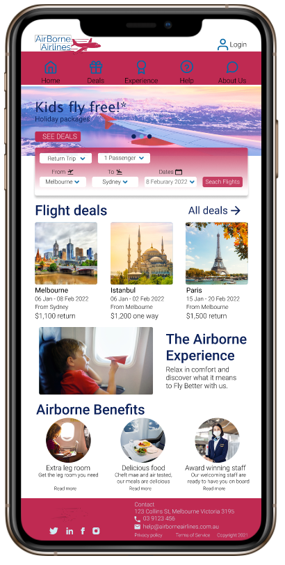
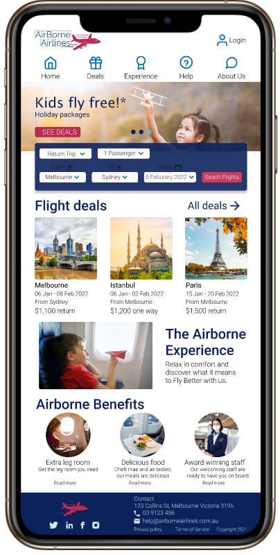
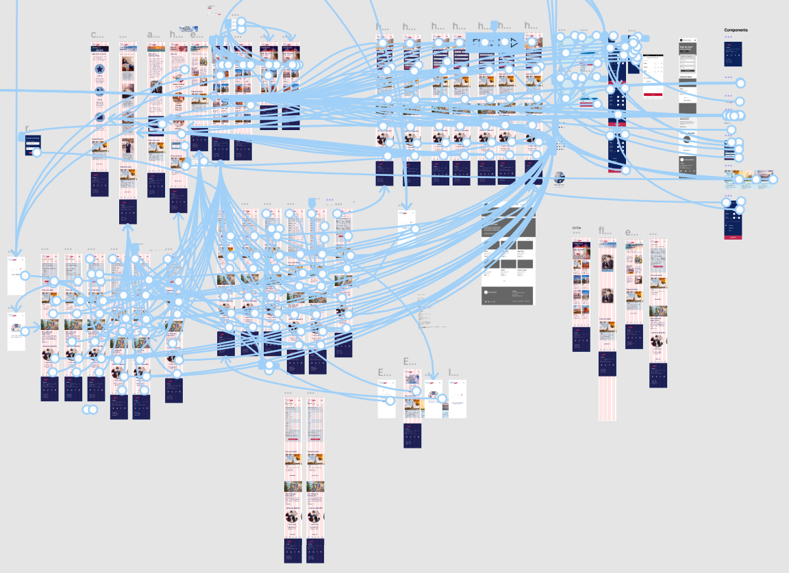
High Fidelity Prototype
As we are progressing our project from mid-fi screens to hi-fi clickable prototypes by adding interactivity and motion. A prototype is a working mock-up of the product that mimics how the interface will behave once developed.
Focused on simple interactions like ‘tapping’ or ‘scrolling’ and connecting current pages and screens, I made a hi-fi prototype using the prototyping tool in Figma. Even though it seems complicated, I had a lot of fun creating it.
“My favourite part of the project was when my hard work started interacting with me.”
Usability Testing or User Testing
This is the stage when we put the prototype in front of actual people. Gauging their reaction and implementing changes are key to developing a mechanism through which we can implement structural and aesthetic changes to improve the quality of our final design. Usability testing helps us find the parts of the designs which most often confuse or frustrate our users.
Usability testing involves asking users to perform a range of tasks or scenarios using the same prototype. As the user does this, they share their thoughts on the experience. I did usability testing with some of my friends and family. My role was to observe and record this process. I asked questions after they have completed their task. In cases where users encountered problems or frustrations, I made recommendations to overcome these usability issues.
Goals of User Testing
- Test the prototype by website users to check the level of fidelity, detail and functionality and user interface (UI) components
- Test visual details such as colour, layout and typography
- Understand how a user feels about the designs
- Test interactive elements such as navigation or the screen flow
Synthesising User Testing
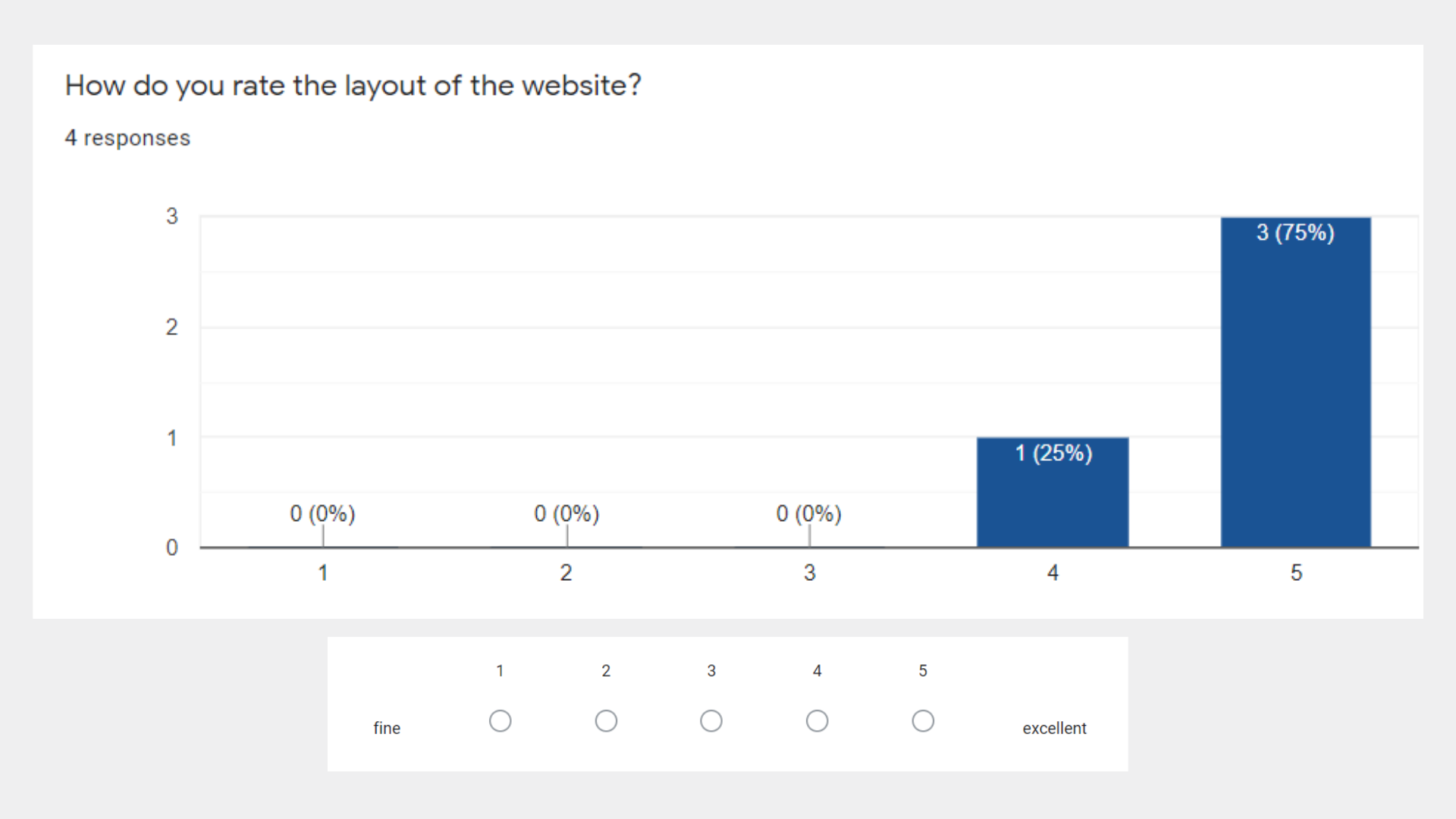
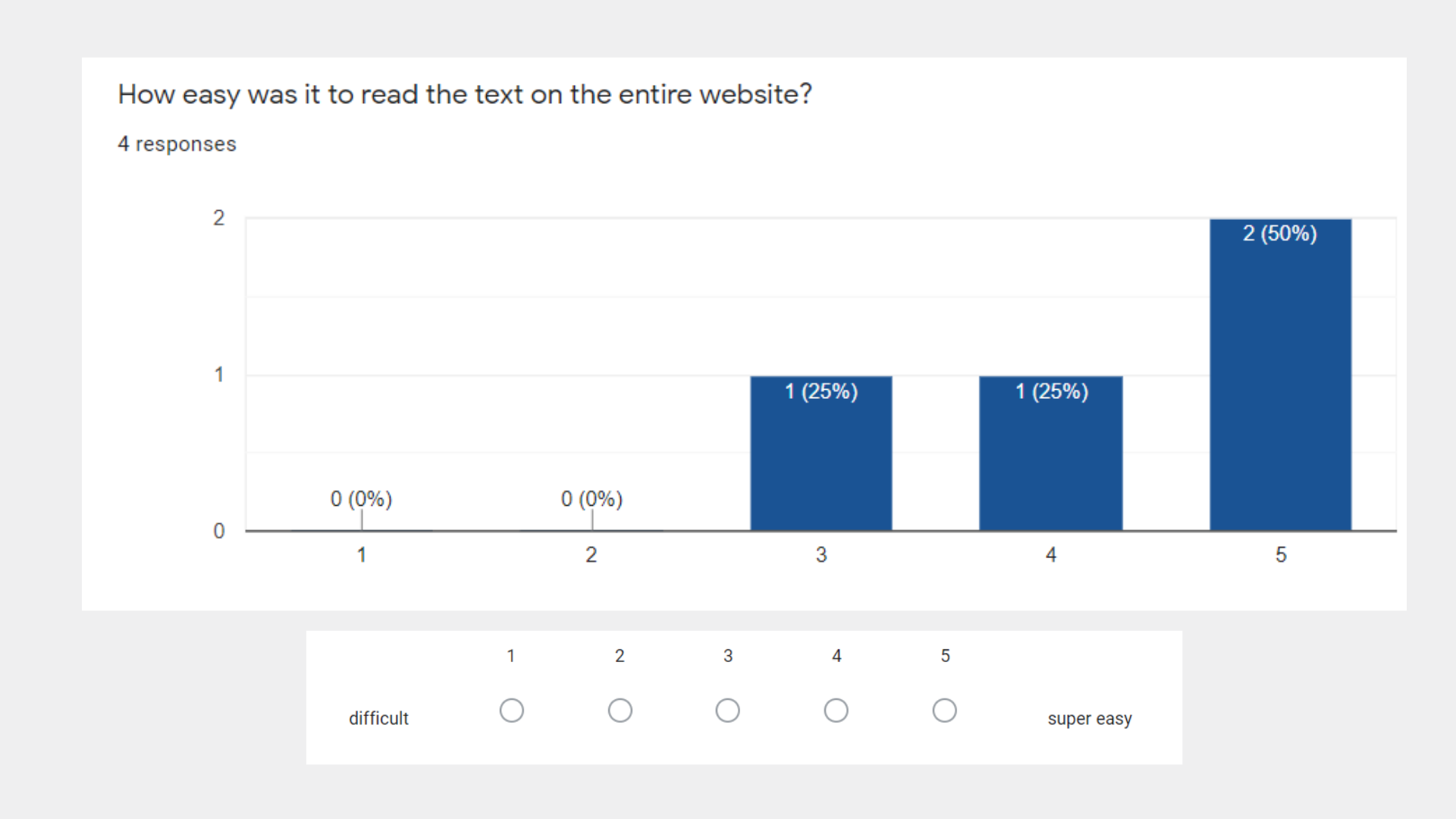
Results from user testing were extremely encouraging and satisfactory.
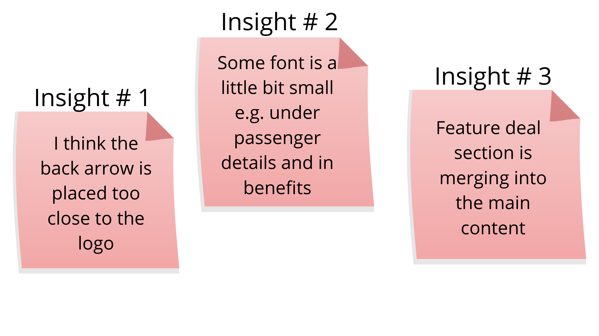
User Testing Insights
I gained valuable insights from the data collected during the research. Following are some of the feedback from the users testing.
User Testing Recommendations
At the end of the usability testing process, I created a final report of insights and findings. A usability testing report should be easy-to-understand and actionable. It helped me to plan future design iterations with clear next steps. Following are three recommendations I made from the most valid insights.
- Reposition the back arrow with the heading in one line.
- Increasing the font size and text box size on the form page.
- Using the theme’s background colour to enhance the featured deal section.
Implementing Recommendations From Testing
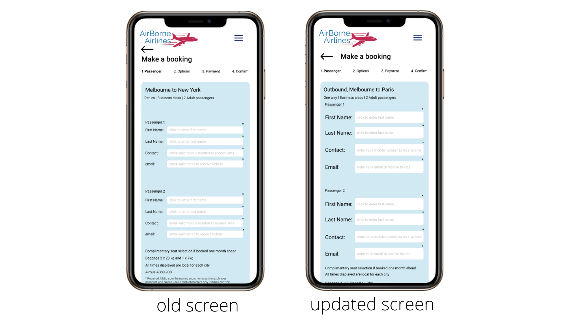
The back arrow was misplaced and provided very minimum space for the user to take action. Therefore, I rearrange the arrow with the title of the screen. Moreover, the size of the text boxes and font was very small. So, here you can see the difference between both screens.
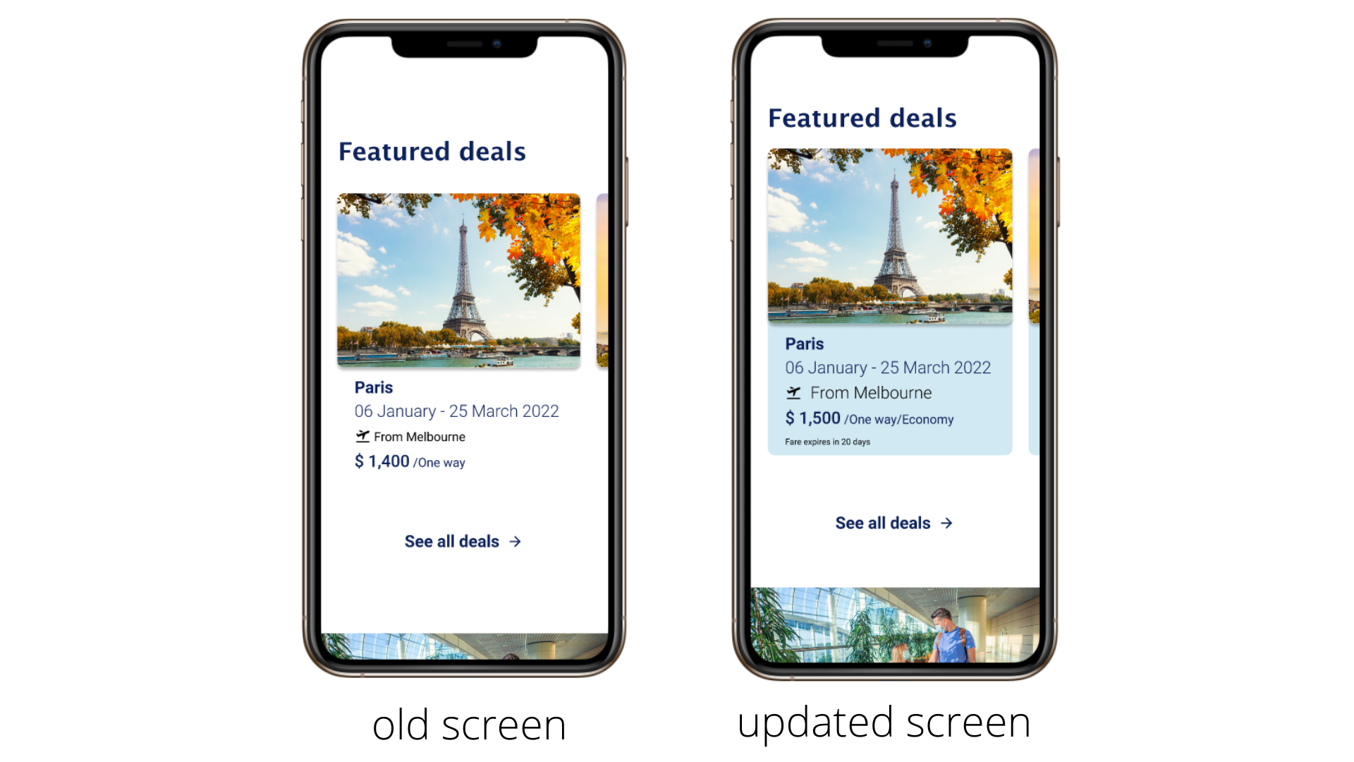
The information on the features deals was merged into the main content. For some users, it was hard to distinguish between the deals. Therefore, I placed an overlay background colour to each deal to make it separate.
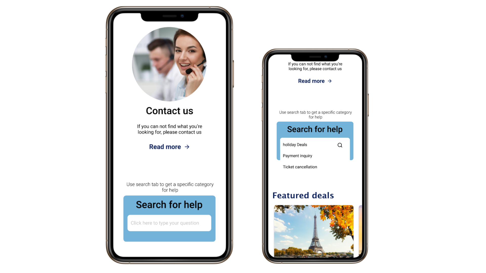
Participants were unable to ‘search’ for help queries on the help page. The search bar will help users get more specific help and solve their problems.
Here You Go!
Check out the prototype yourself. In order to play around with the prototype, we will follow a flow; I am providing you with some scenarios. It is recommended to search based on those scenarios as all the links are not working at the moment.
Scenario # 1:
On Home page:- Search a return flight and book from Melbourne to New York for two passengers in business class.
Name fields will be auto-filled.
Meal options for passenger1 – vegetarian & passenger2 – open for all.
Payment will be auto placed.
The achievement criteria of this scenario would be to receive confirmation and a reference number.
Scenario # 2:
On Deals Page:- Search for a one-way flight from Melbourne to Paris and book it with almost the same conditions as in scenario # 1.
Scenario # 3:
Check out the airline Experience, Benefits and Help page.
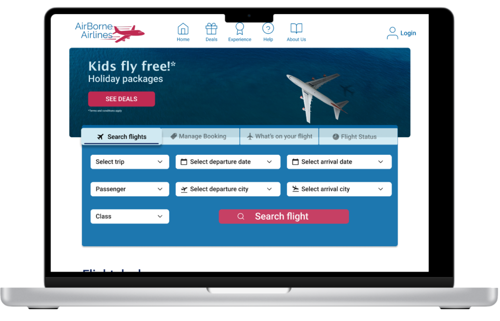
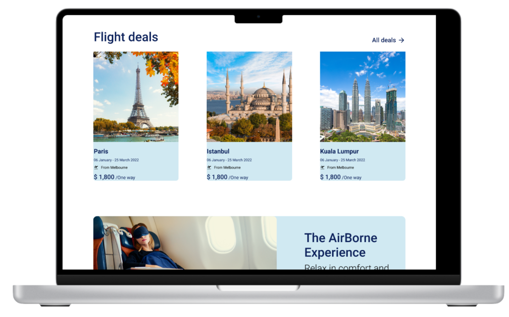
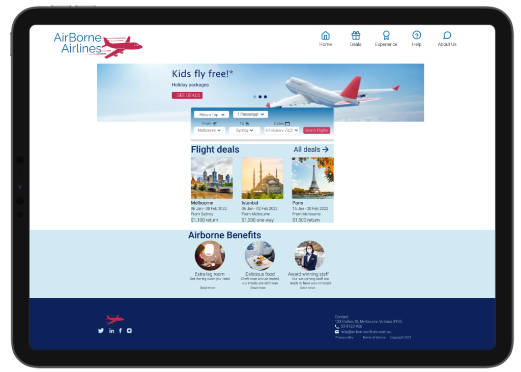
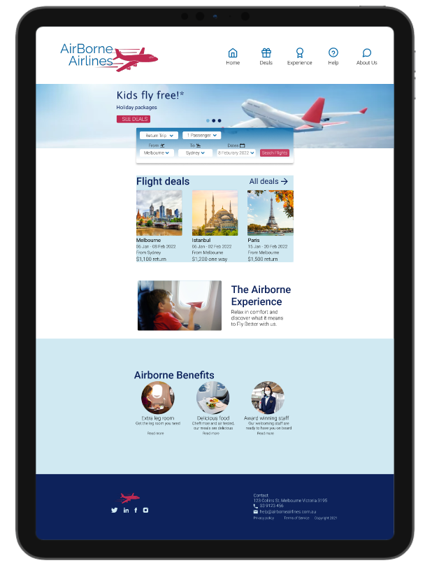
Responsive Website
Laptop screens
Ipad Screens
Next Steps
- Continue to iterate the prototypes to increase the level of fidelity
- The prototype will be handed over to a front-end developer once validated with user testing
Reflecting on the work I’ve done
It was the perfect opportunity to practice my interface design skills with this project. I’m interested in pursuing a career in experience and product design. Therefore, I decided it would be best to just jump into a project and see where it goes.
My biggest achievement during this project was to be able to comprehend various design practices and everything I set out to learn. One of the best parts of the learning and creation processes is curating my own path. I learned what works and what doesn’t. I learned how to do things faster, better, and more efficiently. Along the way, I uncover random things while attempting to find the knowledge you were seeking.
References
- All images used are paid and licenced under Adobe https://stock.adobe.com/au/
- Landscape research: https://www.qantas.com/us/en.html
- Desktop research: https://www.jetstar.com/au
- User testing document: https://docs.google.com/forms/d/e/1FAIpQLSe727zw1u1aB8TN1SOOd9WK81qa9vnuPfVtXnn9BjfqXdhaXg/viewform?usp=sf_link
Thank you for reading till the end!
Let’s connect
I am happy to connect. Please write to me at madihazdesign@gmail.com. Thank you!