Enhancing Usability for Young Learners: Redesigning Showbie’s Task Flow
- Sector: Classroom Management System, Youth Education
- My Role: User Research, Affinity Mapping, Problem Definition, Ideation, Wireframing, Prototyping
- Tools: Figma | Miro | Google Forms | Zoom | Canva
- Time required: completed in 5 working days (from initial hunch to creating a high fidelity prototype)
- June 2021
Hypothesis:
This self-initiated case study began with a simple observation: primary school students often struggle with managing their tasks on the Showbie app. Through user observations, I noticed key challenges: students found it difficult to keep up with assignments, set reminders, and track their progress. One major limitation was the lack of a visual timeline, making it hard for users to see what tasks had been completed and what remained.

Side note: My interest in the Showbie app was sparked by firsthand experience — watching my children use it to communicate with their teachers. As a parent and a UX designer, I couldn’t help but notice the challenges they faced while navigating the interface. These daily struggles inspired me to take a closer look and explore potential improvements from a user-centred perspective.
This case study is not intended to criticise or diminish the incredible work done by the Showbie team. On the contrary, I have great respect for what they’ve achieved — Showbie is one of the most widely used classroom management tools globally, and that’s no small feat. My aim here is to explore opportunities for enhancement, particularly for younger users, through the lens of usability and accessibility.
Understand Showbie – The Classroom Management System
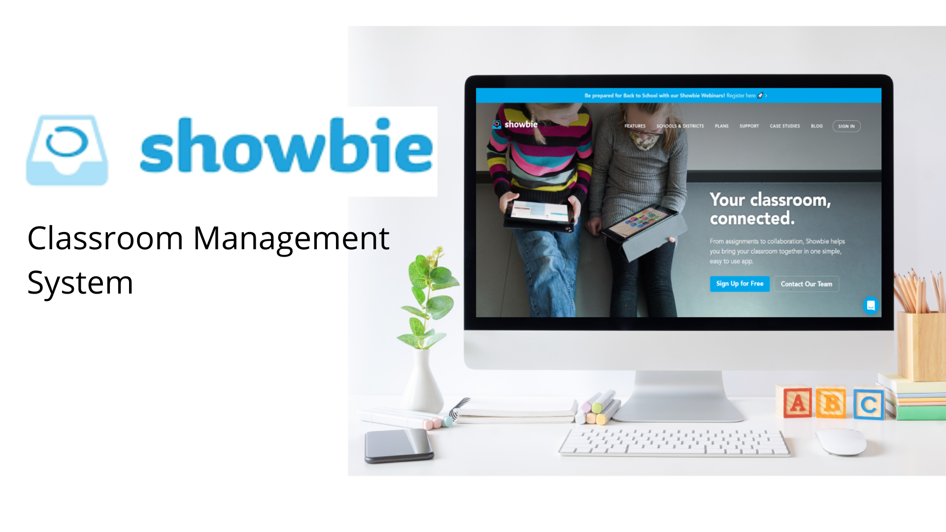
Showbie is a classroom management system designed to streamline communication around assignments, assessments, and feedback between teachers and students. I chose this app for my project because hybrid learning platforms have seen rapid growth in recent years, empowering millions of educators to manage classroom workflows and provide personalised feedback efficiently.
However, as these platforms become integral to early education, it’s essential to ensure they are intuitive and engaging, even for users as young as five. Designing for such a young audience presents unique challenges, and there’s a growing need to make these digital tools more accessible, user-friendly, and enjoyable for early learners.
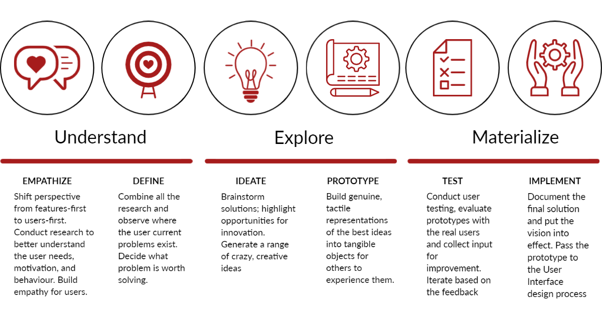
Design Thinking Process
The Design Thinking process is especially effective for addressing complex or ambiguous problems by reframing them through a human-centred lens. It encourages divergent thinking through collaborative brainstorming, followed by iterative prototyping and testing. At its core, Design Thinking is about continuous experimentation — sketching, building, testing, and refining ideas to uncover the most effective solutions.
Goals
Project Goals:
- Create a more engaging and seamless experience for students when submitting assignments and managing homework
- Design a user interface that is intuitive, age-appropriate, and fosters a sense of personal connection
- Approach the redesign with empathy by understanding the unique needs, behaviours, and limitations of young learners
Personal Development Goals:
- Deepen my skills in user-centred design by conducting and analysing user research, mapping user flows, and developing wireframes and prototypes using Figma
- Apply core design principles such as accessibility, simplicity, and consistency to create thoughtful, user-friendly experiences
- Complete a full end-to-end design project — from discovery to delivery — while maintaining alignment with best practices in UX/UI and my design values
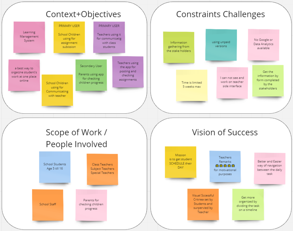
Context Clarifier – a scoping tool
I made a context clarifier to:
- Explore and deeply understand the broader context surrounding the problem or opportunity
- Identify key stakeholders and team members who should be involved throughout the project
- Uncover potential challenges, constraints, or areas that require further investigation before moving forward
- Surface expectations, assumptions, and possible risks early on to ensure alignment and prevent issues later in the process
Desktop Research
As part of my desk research, I explored a range of sources, including website analytics, research reports, online datasets, academic papers, search engine results, blogs, and articles. This secondary research surfaced valuable insights and global perspectives that helped validate my initial assumptions. It also provided a more informed understanding of the problem space and strengthened my motivation to pursue the idea further.
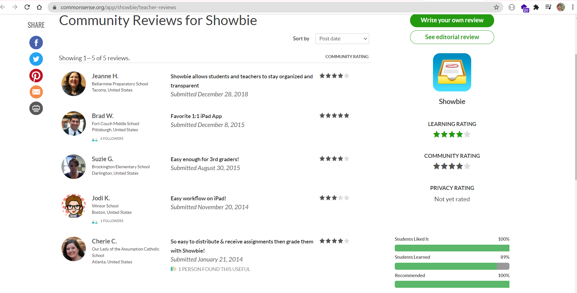
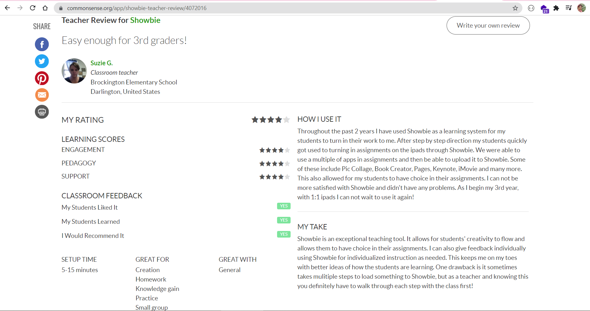
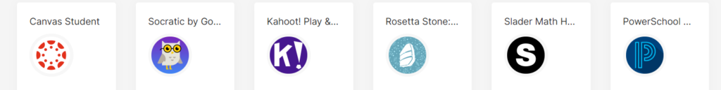
Competitor Analysis
To complement my desk research and stakeholder interviews, I conducted landscape research through benchmarking activities. This involved a comparative review of digital products and platforms offering similar solutions. Analysing competitor experiences helped me identify common design patterns, usability strengths and weaknesses, and opportunities for differentiation. It also inspired potential features and highlighted gaps in the current market.

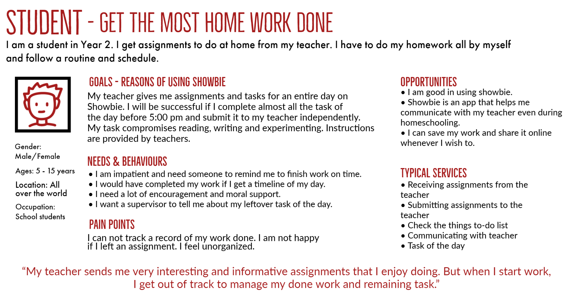
User Persona
User Interview
It’s hard to avoid being influenced by our biases. We are human. However, being aware of biases in UX research is a step in the right direction.

I conducted usability testing with a mix of family members, friends, and school teachers who aligned with my target personas but were unfamiliar with my design work. This allowed me to gather unbiased feedback from representative users and validate key aspects of the experience.
I developed a detailed yet conversational interview guide that helped set the scene for the project and included warm-up questions to ease participants into the discussion. My approach focused on building rapport, making participants feel comfortable, and clearly outlining what to expect during the session.
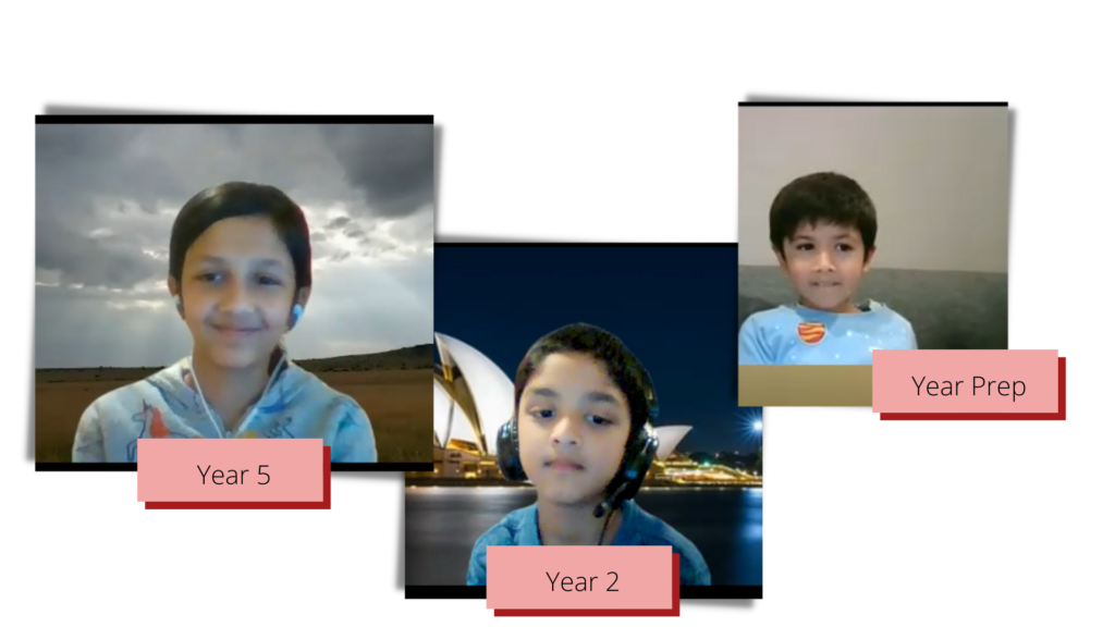
I conducted three 30-minute interviews with students from different year levels. Each participant was asked to share their experiences using the Showbie app and walk me through their typical process for updating and managing tasks. This helped me observe real user behaviour and uncover usability challenges from their perspective.
To gain insight into Showbie from a teacher’s perspective, I reached out to four educators and invited them to share their experiences with the platform. Due to their busy schedules, I wasn’t able to conduct interviews in person, but they kindly responded to a detailed Google Form. Their thoughtful input and suggestions provided valuable context for understanding the educator workflow, and I’m grateful for their time and support.
Analysing Interviews
Quantitative and qualitative research represent two key approaches in user research, each offering unique methods and insights. Quantitative research helps uncover patterns and measure user behaviour at scale, while qualitative research explores motivations, experiences, and context. I deliberately applied both approaches in parallel to gain a more holistic understanding of the problem space during synthesis.
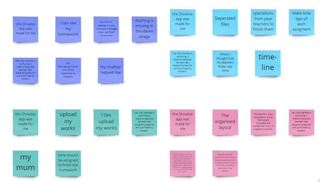
Students’ Response
I took detailed notes during all interviews, which I later organised and analysed on a Miro board. The information was broken down into key themes and insights to support the synthesis phase.
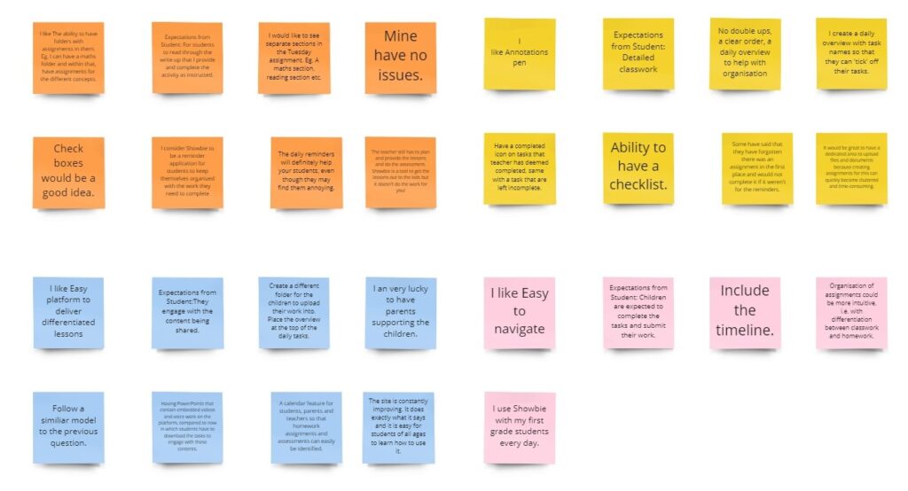
Teachers’ Response
The teachers’ responses from the Google Form were compiled alongside other data sources. I focused on capturing key insights from their thoughts, feelings, and behaviours, including verbatim quotes and direct observations, to enrich the overall understanding.
Additionally, I conducted debriefing sessions after each interview to reflect on and refine my interviewing techniques and overall approach, helping me improve the quality of future sessions.
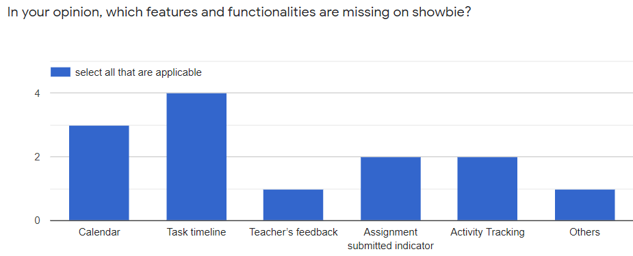
User testing data strongly indicates that the system under review may be missing key functionalities needed to ensure a smooth and efficient experience for all users.
Synthesising the Research
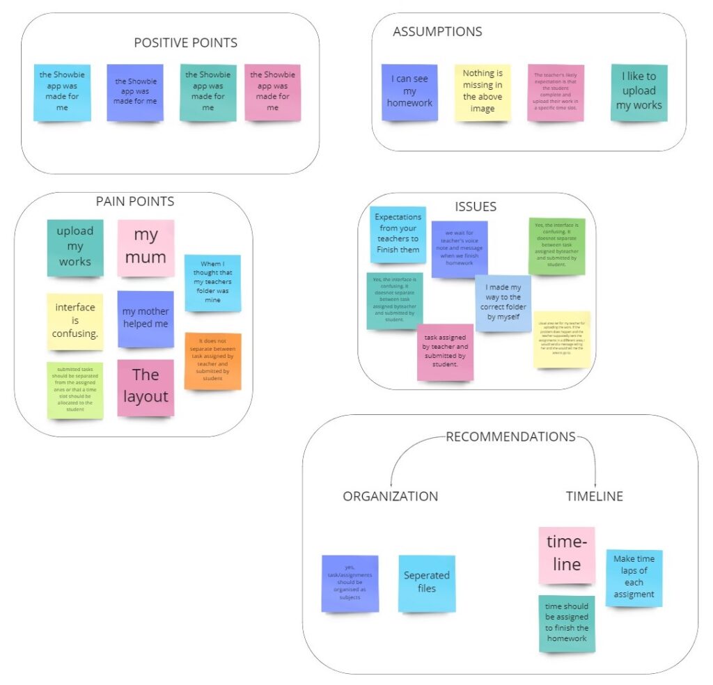
Synthesis is a sense-making process where we uncover meaningful insights from the data collected from our research. We start to look at these individual elements through analysis and synthesis and find patterns, connections, and relationships. By combining these separate elements, we form new groups and themes. This leads us to uncover the insights from our research: the ‘why’ and ‘what’ it means.
Affinity mapping is a process where we group, create relationships, and find patterns in the collected data. For example, I created the themes and post-it notes on the Miro board, where I grouped the participants in their cluster. This way, I can see each person as a whole in terms of their post-it notes. So, I put them all together side-by-side and started grouping them to what I think may be similarities.
There’s no right or wrong while creating a theme. I just basically matched it to fit the context and what makes sense to me. It’s great to have verbatim quotes because we get the words from the actual user instead of any interpretation or judgment that we overlay.
Insights
Once I established my affinity map, I began to draw significant insights and develop functional and inspired solutions. An understanding is a factual and novel finding of user motivation that leads to or reflects an opportunity for our team to explore. Insights offer new ways to interpret the problem space. They compel us to re-examine our perspective and articulate a unique point of view.
I received a positive response to our initial hunch. Students faced issues in keeping track of their daily tasks on Showbie. Some students looked for help from their parents in organising their work.
- Students get confused between their folder and their teacher’s folder.
- Students make assumptions about the task assigned by their teacher and what to do with it, and where to submit it.
- Teachers create a daily overview with task names in the form of an image so that students can ‘tick’ off their tasks.
Recommendations
From these insights, I developed three recommendations for the case study.
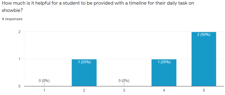
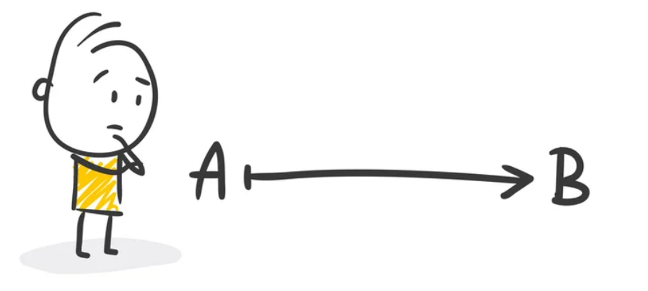
The image below is an example of the required timeline.
- Introduce a visual timeline for tasks assigned by teachers, enabling students to see a clear sequence of their work and easily mark tasks as complete.
- Implement an automated task assignment flow on the teacher’s side, so students receive a generated list of tasks that can be conveniently tracked and checked off as they progress.
- Integrate a reminder feature within Showbie to help students stay organised and on top of upcoming deadlines and assignments.
CONCEPT DESIGN AND CONCEPT REFINEMENT
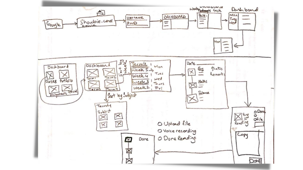
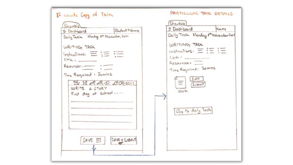
User flow
I began the ideation process by mapping out an ideal user flow. This provided a clear starting point and guided me through a series of steps leading to a successful outcome and final action within Showbie.
Crazy 8
Crazy 8s is a powerful sketching exercise commonly used in design sprints to rapidly generate ideas. The challenge is to sketch eight distinct concepts in just eight minutes, encouraging creativity without getting bogged down in details.
I used the Crazy 8s technique to quickly explore improvements to the existing user flow for daily tasks, keeping user testing insights and recommendations at the forefront of my ideation process.
1. Visual Timeline
Create a horizontal timeline that shows all assigned tasks in chronological order, with clear markers for completed and pending work.
2. Auto-Generated Task List
Implement an automated system where teachers upload assignments once, and students receive an updated, easy-to-navigate task list with checkboxes.
3. Built-in Reminders
Add a reminder feature that notifies students about upcoming deadlines and unfinished tasks, customizable by the user.
4. Progress Tracker Dashboard
Design a simple dashboard summarising completed, pending, and overdue tasks, with motivating progress indicators like stars or badges.
5. Interactive Checklist
Enable students to tick off tasks directly on their task list, with animations or sounds for positive reinforcement.
6. Quick Add Notes/Questions
Allow students to quickly add notes or questions related to specific tasks, improving communication and personal organisation.
7. Teacher Feedback Loop
Create a feature where teachers can leave quick feedback on submitted tasks, visible alongside each task on the timeline or list.
8. Visual Task Categories
Use colour-coded categories (e.g., homework, assessments, projects) to help students easily differentiate types of tasks at a glance.
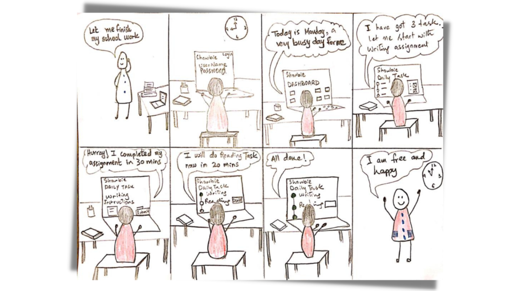
Storyboard
Storyboarding is the act of visualising or sketching how a solution could be realised with text narration and notes in a series of chronological steps. It is a highly efficient way of explaining a customer’s experience by articulating an idea or some views into an easily understood visual narrative.
In the context of user experience design, a storyboard needs to effectively communicate a user’s context; here, I tried to capture what a user sees, does, hears, thinks and feels before, during and after interacting with the potential solution.
Prioritisation – Effort vs Impact
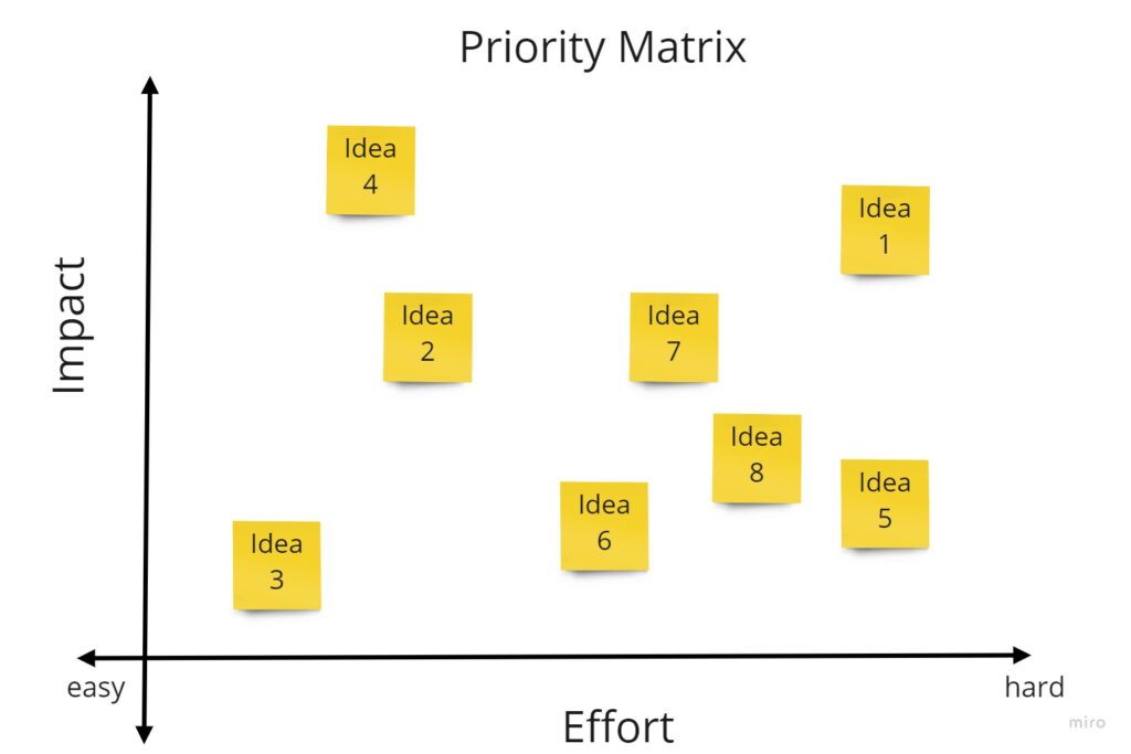
In the context of UX, prioritisation means mindfully selecting solutions that are most fit for the purpose.
The user-centred design framework is practical when prioritising because it helps you to consider the desirability (for the user), feasibility (the technical considerations) and viability (the financial impact). This method quickly prioritises ideas/concepts or features by using the two factors of effort and impact.
User testing results helped me decide which features users find most valuable or most challenging to use. I assigned my Crazy 8 ideas on an impact and effort score. Mapped these scores in a 2 x 2 quadrant, with relative effort on one axis and relative impact on the other. High impact–low effort idea was an ‘easy winner’.
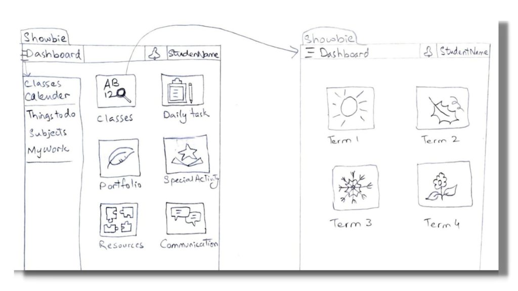
Low-Fidelity Prototype
A prototype is a rough version of what you think a final product or service might be. Prototyping allows you to quickly transform an abstract idea into something more concrete that your audience can see and touch. Paper prototyping is usually used at the ‘concept’ and ‘test’ stages.
I turned the best abstract idea into something more concrete that our audience can see and touch. With the help of a low fidelity paper prototype, I generated divergent ideas and explored multiple ways of solving the problem.
USABILITY TESTING – Insights and Recommendations

Three usability tests were conducted with three app users and obtained feedback on your low-fidelity prototypes.
Almost all testers agreed that it was an efficient and easy solution. They did not find any issue or problem. As a result of the testing, we continued to the next step of developing more detailed prototypes.
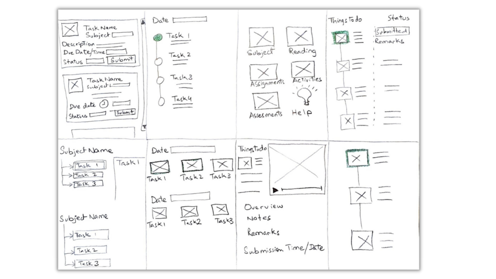
Mid-fidelity prototype
The next stage is the simulated experience of the application in the form of Medium Fidelity Prototype, which includes interactive functionality and full navigation. Mid-fidelity prototypes are usually a product of your previous iterations. In this case, these are our low-fidelity prototypes and usability test findings.

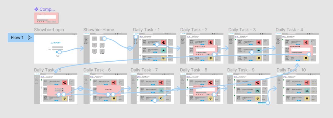
Here You Go!
You can see the mid-fidelity prototype created for the case study in Figma, showing the user flow of completing daily tasks on a timeline.
Iteration
Iteration is one of the cornerstones of UX design. Keep testing the prototypes with users and get feedback to refine the design and make sure we are designing a product that meets their needs. Testing often and creating iterations at this stage is easy, and making changes isn’t difficult. Following this practice ensures that we are designing the right product, which will save time and money in the development stages.
Continue to iterate the prototypes to increase fidelity and introduce user interface (UI) components.
- Test visual details such as colour, typography and copy
- Understand how a user feels about the designs
- Test interactive elements such as navigation or the screen flow
- Communicate details and functionality to the product team
This isn’t the end. Instead, I’d continue iterating and increasing the fidelity to create a hi-fidelity design.
Reflecting on the work I’ve done
I knew it was the perfect opportunity to improve my design skills with this project. I had just started a course in UX design, and I wanted to pursue a career in experience and product design. So I figured the best way to learn would be to just throw myself into a project and go from there.
Within the three weeks, I was able to comprehend all the things I set out to learn in order to deliver this case study and so much more. One of the best parts of the learning and creation processes is curating my own path. I learned what works and what doesn’t. I learned how to do things faster, better, and more efficiently. I learned random things along the way while trying to discover the thing I actually set out to learn.
“The cherry on top of all this is that it doesn’t end here. There is always more to learn. Nothing is easier in design process. Rather, you become pro at it with time and practice.”
REFERENCE
- SHOWBIE: https://www.showbie.com/
- Landscape research: https://www.g2.com/products/showbie/reviews#survey-response-4402845
- Desktop research: https://thelearningcounsel.com/article/assignments-collaboration-showbie-easy-use-classroom-management-platform-0
- Online reviews: https://www.g2.com/products/showbie/competitors/alternatives
And that’s a wrap. Thank you so much for reading till the end!
Let’s connect
I’d love to hear from you! Feel free to reach out at mz.uxdesigner@gmail.com. Thank you for visiting my portfolio.